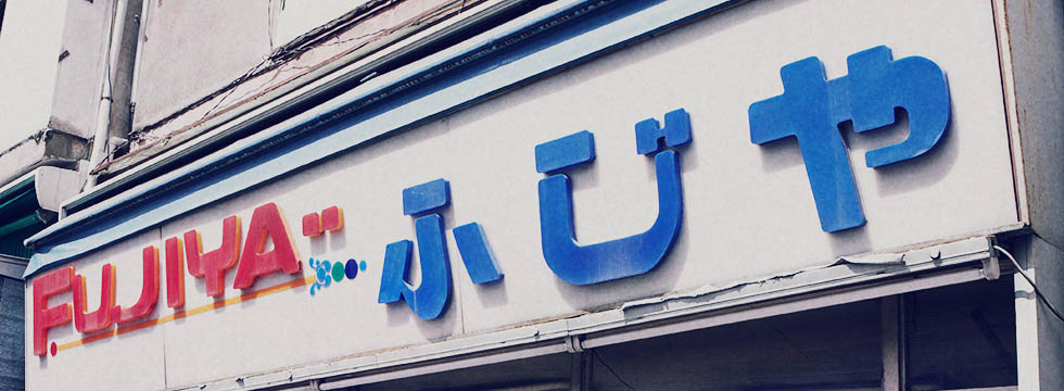
丸く、そして太い。ふくよかな女性を思わすそのフォルム。文字のディテールには、時代を感じさせる意匠が。そこはかとない安心感のある、母親のような書体。
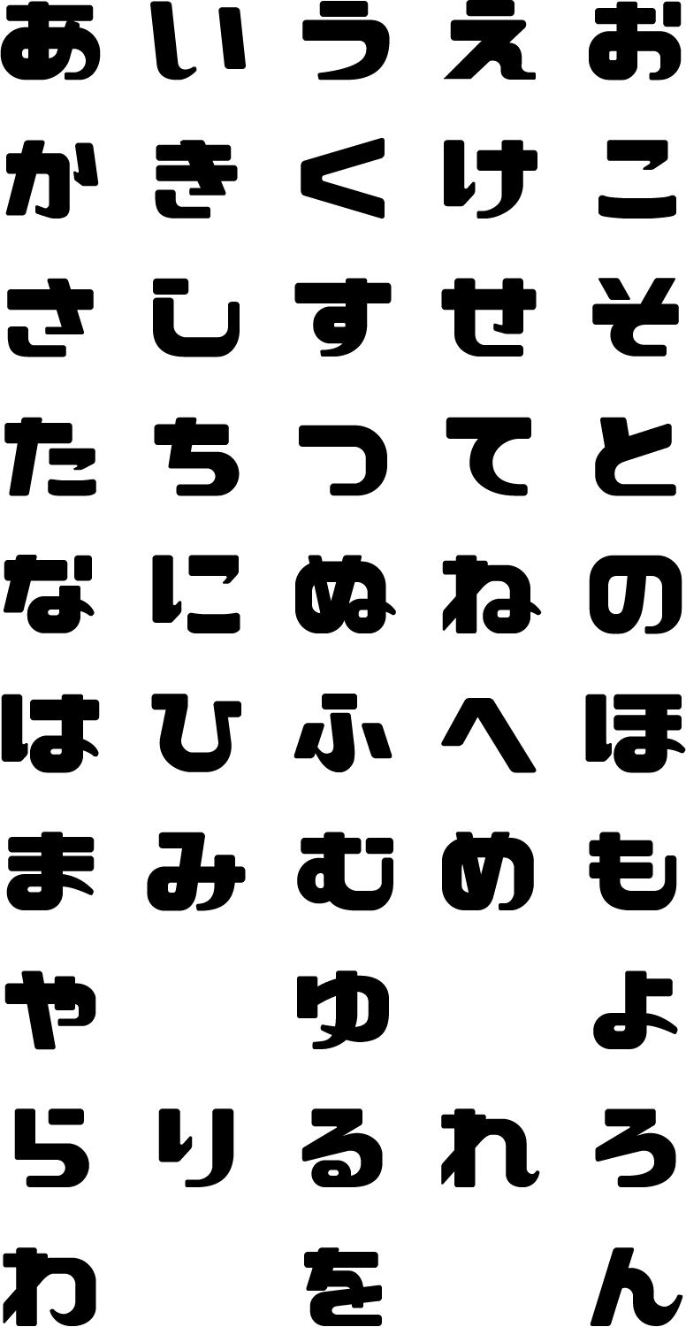
こちらのフォントデータをパソコンに入れることで、いろいろなアプリケーションでご使用頂けます。「DONATE & DOWNLOAD」を選択すると、のらもじ発見プロジェクトを資金面で応援することができます。(廃業してしまったお店や、寄付をお断りされるお店が多いため、現在お店への支払いは停止しております。)無償でのダウンロードをご希望の際は、SNSでのシェアにご協力ください。
You can download the font and use it in your computer. By selecting DONATE & DOWNLOAD, you can financially support our project. (Due to the fact that many stops have gone out of business or refuse to accept donations, we are currently suspending payments to shops.) If you want to download for free, please help us by sharing the project via SNS.
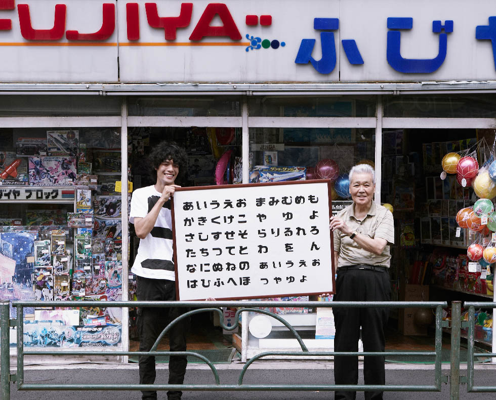
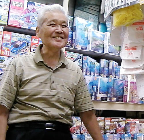
「ふじや玩具店」は戦後、粘土を作る製造業から小売業に転身した玩具店。すぐ近くにあった藤棚にちなんで「ふじや」の屋号にしたとのことで、看板は副店長の横山さんが知り合いの業者さんに頼んだそう。玩具店らしい、可愛らしい書体ですが、横山さんは今まで看板の書体を意識することはなかったようだ。「周りには、お店は辞めないで続けてくださいと言われるよ。次々と小さいお店はやめてっちゃうからね。でも、なるようにしかなんないからね。出来るだけ何とか続けるよ。」と横山さんは語る。
“Fujiya Toy Store” is a toy store that changed its business from manufacturing to retailing after World War II. The name “Fujiya” was from the Wisteria trellis located just in front of the store. The signboard was made by a friend of Mr. Yokoyama, the second owner. Mr. Yokoyama said he asked a friend to make it. The typeface is cute and expresses an image of a toy, but Mr. Yokoyama had never been conscious of the typeface on the sign until now. People in the neighborhood tell me to keep going and not to quit the store. “Small stores are closing one after another. But what will be, will be. I’ll keep going as long as I can,” Yokoyama said.